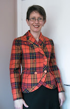
 I mentioned in a recent post that the floaty wrap blouse from Burda Magazine (February, 2009) would soon make another appearance, in a form closer to what Burda intended.
  I'm sort of unconvinced. This is a printed wool blend sweater knit, which loses its sweateriness if you look at it from more than a foot away, at which point it looks ... kind of faded and tired, if I'm honest.
Up close it is pretty interesting. But I don't want you to be THAT close!
 I tested this pattern (designed for a single layer construction of very light woven fabric) with a single layer of a hideous acrylic jersey from stash and kind of liked it. But for this printed jersey I needed to face the "lapels", which introduced a structure absent from the original. I drafted a pattern piece for the facing. On auto-pilot, I actually interfaced these pieces (Facings.Must.Be.Interfaced...). What was I thinking? Way too stiff. It is, however, possible to pull fusible away and cut it out, which I did today. I like it better, but it's not my most favorite piece ever.
 Here it is with my orange cashmere skirt - already a favorite even though I've only worn it a couple of times.
What do you think?


I never would have guessed that an orange skirt would be so versatile. But it looks lovely in all your pairings.
ReplyDeleteI think the sweater top looks fine. But only you can judge how it feels.
I know that I rarely wear this top, even though it looks fine. It's just too fussy to arrange the lapels and wrap.
http://badmomgoodmom.blogspot.com/2010/05/vogue-8657.html
It certainly looks nice with that orange skirt!
ReplyDeleteI think it's really pretty. it's a fun sort-of-southwestern print, and i think the blend of colors really flatter you.
ReplyDeleteI think you look wonderful! The sweater/jacket looks cozy and comfortable, but has structure. Job well done!
ReplyDeleteI think it looks soft and cozy - a win!
ReplyDeleteI can see what you mean--the colors are meant to be muted, but they could read faded. I'd consider edging the lapels with bias tape in a brighter color (the orange of your skirt would be fabulous) or even black, any color that perks up the muted colors and makes the garment read "Hey, I'm New!" to the world.I can definitely see why you were drawn to the fabric...those colors are lovely on you, and they also reflect the pattern of the carpet in the photo.
ReplyDeleteI like it. Yes it is a bit muted, but with that gorgeous orange skirt I think that might be a good thing! The jacket has great shape. I like the asymmetric hem.
ReplyDeleteStanning! I like your version very much!It for sure would keep me warm during the cold days here...
ReplyDeleteI love the softness of the color and print. It looks like a great top to me.
ReplyDeleteI like it--the muted tones in real life could read either sophisticated or faded--I think it looks lovely with the vivid orange skirt.
ReplyDeleteI really like the cut of the pattern, but the fabric I'm not sold on I'm afraid... I think because it reminds me of faded aztec rugs. I think I'd be inclined to go with something lighter on the top if it was me... I love that skirt though :)
ReplyDeleteThe style of the top is really beautiful, but the print doesn't seem to enhance you. Maybe a necklace to brighten it up?
ReplyDeleteI love the soft muted print. I think I'd pair it with another color - black, brown, grey, cream - and see what you think. It is a perfect top to add a statement necklace or a beautiful pin. The orange is a beautiful skirt, but not sure it's a good complement for the top, the intensity levels of the two pieces seem to clash.
ReplyDelete