Well, it's done. Meh. As you can see at right - Exhibit A - my version (MV). Below - Exhibit B - is the Vogue version (VV).
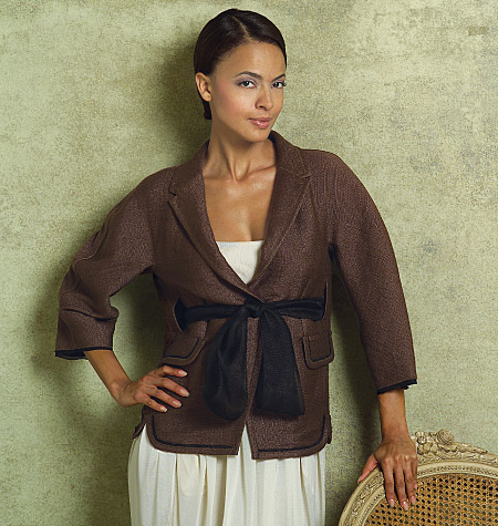 I do believe Vogue has engaged in a little pattern manipulation to ensure that MV does not bear enough similarity to VV to be cute and perky instead of .... bathrobe-ish.
 The VV is visually square and blocky - looks fresh. The MV not so much. It is rectangular and droopy.
Both jackets are cut in the middle by the tie belt, but the MV tie is lower on the body. The pocket flaps are higher on the VV. The tie belt is shorter on the VV.
Partly this is explained by fabric choice - the VV is evidently made of a crisp silk whereas I chose a drapey knit. But I think the proportions are off.
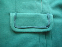
The VV is a veritable sampler of weird sewing/finishing techniques, some of which I chose to ignore. Thinking about trying to describe them all makes me tired. So here are some details of MV:
Pocket flap - This is a single layer of fabric with an applied facing edge, into which the trim is inserted. The edge of the edge is raw, the trim has raw edges (VV had bias-silk Gazar; I used a thin jersey knit).

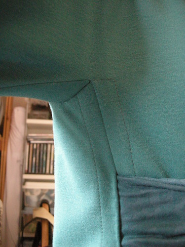 The underarm gusset and side panel. The latter has wide 1" (2.5cm) seam allowances which are topstitched (I used a triple-stitch about 4.5mm long). You leave two openings in this seam - the upper for the belt and the lower for the pocket (the flap is decorative).
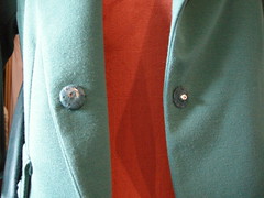
I had to tack the belt to the back of the side seam opening to keep it from rolling down to the bottom of the opening, making the jacket look even more bathrobe-ish.
A covered snap at CF.
I'm moving on. Time to tackle the Jalie jeans pattern, and I need a nice pair of shorts.
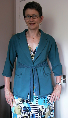


Too bad, so much work, so little reward! But it's a beautiful bathrobe! Sue Anfang
ReplyDeleteYou have a much cuter figure than the teal jacket shows. Too bad :(
ReplyDeleteHello Kay!!
ReplyDeleteCan the belt come off (somehow)... ? Maybe you'd be more pleased??
Soft hug,
Rhonda
Too bad this jacket didn't work out better for you. On a good note - the teal colour is great on you!!
ReplyDeleteSeriously, the back looks nice. :)
ReplyDeleteI think get rid of the belt. It seems to make it look like it's pulling or something, as you can see the back on each side, and it makes you look a little 'bundled up'. As cidell said, it's not as cute as you are. Maybe a regular belt would be better, or wear it open. It could be a great in-the-car jacket when you get cold. Her shape is completely different than yours, and I think that's the proportion thing you mentioned. Too bad all your nice work couldn't save this jacket. It does sound like the instructions were very odd.
This project is worthy of redemption - the teal ponte is beautiful. I agree with Liana's suggestion to remove the belt. A belt under the bust on anyone over 30 is wrong, wrong, wrong. I also suggest taking the trim off the pockets. It may be possible to shape the side seams a little to eliminate the blocky effect. You need to unpick the sides to remove the belt anyway!?
ReplyDeleteBTW I recently purchased some orange ponte to make just the type of jacket you envisaged.
I agree with Cidell- this does not show off your beautiful shape. I'm a rectangle so the empire look works, but you have a beautiful waistline- flaunt it!
ReplyDeleteBeautiful color and workmanship, as always.
I have always admired this pattern. I am pear shaped and did not think it would suit me...I think it is more for the big busted, but I love the pattern so much I have thought about buying it for my Mum.
ReplyDeleteJust comparing YV to the VV... You say that the VV is square and blocky and yours is rectangular and droopy...do you think that some of this visual may be due to the belt. In the VV, the belt appears wider and much shorter than in YV. Perhaps by changing the belt fabric you could get more of the look you were after. The contrast belt colour on the VV would also visually shorten the jacket.
Also, if you look at the length of the sleeves compared to the length of the jacket, you can see that YV has a much longer bodylength than sleeve length, compared to the VV. Perhaps you could shorten the jacket if it is unlined, to get more of the proportions you are after.
So much work! Beautifully made! What if the belt was tied in the back and you added some kind of closure (buttons/snaps) to the front?
ReplyDeleteKay....so well made, your skills are top-notch.
ReplyDeleteSo sorry it was a disappointment, but the color is so flattering !
Spoken like a true attorney (Exhibit A MV) (Exhibit B VV)...hehehe....
ReplyDeleteSeriously tho, I agree if you take the belt off, it would look better....
You did a beautiful job, as always!!! Top notch seamtress!!
Isn't it fabric, colour, extent of contrast between the belt and body and shoulder pads. And don't you feel that a swirl of mist comes into one's head when one makes a 'designer pattern' in contrast to selecting an 'ordinary pattern'- in which case, the VV model's toasted almond skin might have something to do with it? I know myself that I become submissive to a designer's vision and tend to comply with their fabric choice but not so for an ordinary pattern.
ReplyDeleteFinally, I actually like your jacket taken in its own beautiful terms. Susan